
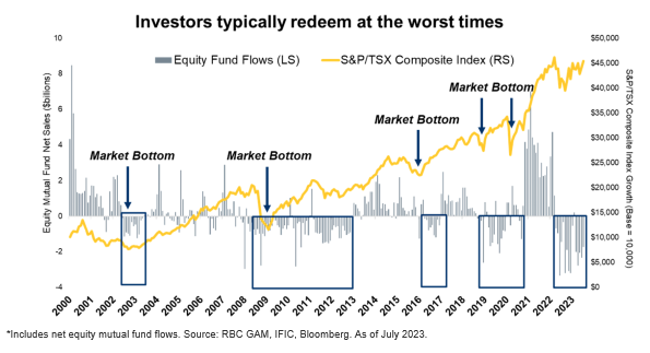
Everyone knows to buy low and sell high, however, what do investors actually do? The blue bars illustrate the amount of new money invested in the stock market. The orange line illustrates the performance of the market. During downturns, you can see that people purchase fewer funds, and consequently, they purchase more when markets are advanced/advancing.